Choosing a Color Scheme
Look at the miniatures that win awards. What do you find they all have in common? Their colors work well together. They compliment and contrast in ways that call attention to interesting portions of the miniature and bring out details.
Understanding colors is often at the heart of the best painted miniatures. This guide won't teach you everything. In fact, the last section of this page will give you a cheat sheet you can use to select colors that work well together at a glance.
Primary Colors
The primary colors are:
- Red
- Yellow
- Blue
They are called primary colors because from these three colors, ideally you can mix any other color.
This is valuable to know, since if you buy one of each of these colors, you can mix most any color. This way, you can use a rainbow of colors without buying so many paints. You'll spend less. We'll discuss warm and cool colors later on this page.
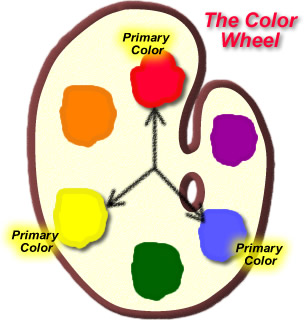
The color wheel begins with the primary colors: red, yellow, and blue.
Secondary Colors
Mix the primary colors in equal proportions and you get the secondary colors. They are:
- Orange
- Violet/Purple
- Green
On the color wheel to the right, you can see how to mix each of the secondary colors. Between red and yellow on the color wheel you find orange. To mix orange, combine red and yellow. It's as simple as that.
Knowing how to mix secondary colors, you have effectively doubled the number of colors you can mix from your original three.
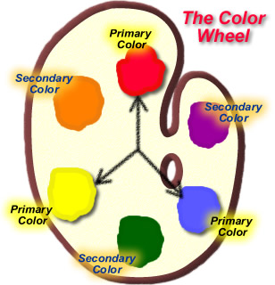
The secondary colors are Orange, Violet, and Green.
Tertiary Colors
Mix a primary color with one of the secondary colors next to it in equal quantities. The resulting color is called a tertiary color.
The tertiary colors are:
- Red-orange
- Red-violet
- Blue-violet
- Turquois
- Yellow-green
- Yellow-orange
Knowing how to mix secondary colors and tertiary colors has increased the number of colors you can mix from 3 to 12.
Naturally, there's an infinite number of colors you can mix by varying the proportions of the primary colors, but even the 12 shown on the color wheel at the right gives you a lot of color possibilities from the 3 primary colors you purchased to get started.
Eventually, you'll probably want to invest in a set of secondary colors as well to speed the process of mixing colors.
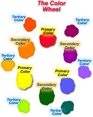
The tertiary colors are Red-Orange, Red-Violet, Blue-Violet, Turquois, Yellow-Green, and Yellow-Orange.
Harmonizing Colors
Secondary colors harmonize well with the primary colors you mix to get them.
Colors which lie in close proximity to one another harmonize well. You can place them next to each other and they will not clash or look bad together.
Blending between harmonizing colors creates a pleasant, natural transition. In nature,
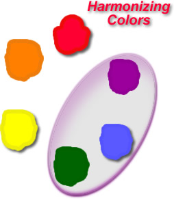
Harmonizing colors tend to go well together, but without contrasting colors, a miniature's contrast isn't as great as it could be. This may be what you want, for a less flashy look.
Complimentary Colors
Complimentary colors lie directly across from one another on the color wheel. Find compliments to the most common colors in the chart on the right.
The left-hand column shows each primary color and its complimentary color. For example, the complimentary color of red is green.
The right-hand column of colors includes each of what are known as tertiary colors. These are combined by mixing a primary color in even proportions with the secondary color next to it on the color wheel.
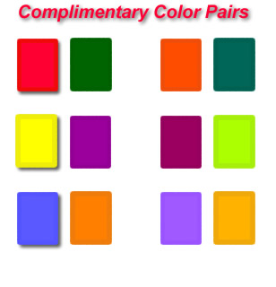
Complimentary colors provide high contrast. You often will want to use complimentary colors on a miniature for accent details that you want to stand out, or if you want a figure to stand out more.
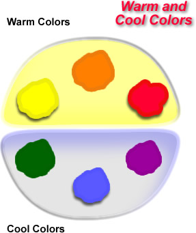
Warm and Cool Colors
Divide the color wheel in half, as shown on the right. The top half include the warm colors:
- Yellow
- Orange
- Red
The bottom half of the color wheel contains the cool colors:
- Green
- Blue
- Violet
Warm colors are normally more vibrant and exiting, creating feelings of excitement.
Cooler colors are more subdued. Use these to moderate the warmer colors and to provide contrast to them.
Warmer colors include Yellows, Orange, and Red.
Cooler colors include those in the range of Green, Blue, and Violet.
An Inexpensive Way to Get Started
It's possible to get started painting miniatures on any budget. A set of acrylic paints like these are all you need to start painting. These 18 colors include the primary colors, the secondary colors, black, and white.For the price, you can't beat this set, and each paint holds 2 fluid ounces, four times as much as the .5 oz containers you get in much more expensive paints by miniatures companies, so you won't run out anytime soon.
Limited Palette Color Scheme
Too many colors can produce an unharmonized circus of colors. For example, the chaos dwarf to the right incorporates yellow, blue, red, violet, turquois, and ivory.
Your eye wanders around the piece, not really focusing on any one feature. This disharmony of colors
Typically you'll want to use no more than two main colors. Select one warm color and one cool color to gain contrast. You can select a third color such as black, white, or ivory, which are not primary or secondary colors with which to provide a neutral tone which makes the main colors stand out more.
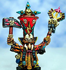
Using too many colors (especially too many contrasting colors) creates a confusion of hues which some may think garish or overdone.
worth a few dollars/Pounds/Euros?
I don't sell anything on this site, and I provide all information free of charge, so if this site has helped you, please consider donating to help support adding more content to this site. Just click on the Tip Jar image above.
If everyone pitches in just a few dollars/Pounds/Euros, I can add videos and more tutorials to serve you even better.